Creating a Stand-Alone Command Button
The following instructions are just one example of how a button can be drawn and what a button can command.
Scenario: You want to create a button that you can click from within a graphic, for example, to command the Out_of_Service property of a Life Safety Point.
- You have completed the steps in Preparing to Create Controls to Command Objects.
- You have reviewed Command and Navigation Properties and have a full understanding of the fields and the options available to you for configuring the command control.
- Click a drawing element and then draw a shape for the button, for example a rectangle, on the canvas.
- Select the button (for example, rectangle) element on the canvas, and from the Property View, expand the Colors property group. The button element must have a color associated with the Background or Fill fields, so that it has a selectable area. If you leave both properties blank, the button element cannot be selected. Format the button element using the following properties.
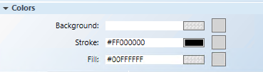
- Background: Type the name of a color for the background.
- Fill: Type the name of a color for the command control outline.
- Stroke: Type a name of a color for the command control characters.
- Select the element on the canvas, and from the Property View, expand the Command and Navigation properties group.
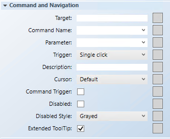
- From System Browser, drag a designated data point into the Target field.
NOTE: If the target designation does not specify a property, the default property is targeted. Otherwise you must specify the property by typing a period (.) and then the property name after dragging the data point into the Target field, for example:CCProject.LogicalView:Logical.PXRack.B.Block.Hcrv;.Property_NameFor this example: drag the Life Safety point into the Target field, and then type:.Out_Of_Serviceat the end of the Target path.
NOTE: If a data point is selected in System Browser, or a symbol instance of the data point is selected on the canvas, the data point information is displayed in the Extended Operations tab. From there, drag the property you want to target into the Target field. The property name is added automatically. - From the Command Name drop-down menu, select or type the command rule that you want to apply to the property. If you manually enter the command name, it must match the name of the command in the Models and Functions Command Configuration section. This field is case-sensitive.
In this example, type or select OutOfSvc. - In the Parameter field, select the values from the drop-down menu or replace the hardcoded values by typing the command values in place of the existing values. If you do not want any hardcoded values, then delete “=x” from the expression. This allows you to command the target with the button on the graphic.
In this example, leave the field blank, as there is no parameter. - From the Trigger drop-down menu, select how to initiate the command: Single click or Double click.
For this example, select Single Click. - (Optional) In the Description field, type a brief description of the command that will appear in the tooltip.
- From the Cursor drop-down menu, select the cursor preference that you want to display when the command is active.
- Select the Command Trigger check box to enable the command control to initiate and send a command.
- (Optional) To disable the command control, select the Disabled check box, and from the Disabled Style drop-down menu, select how the disabled command control displays when disabled. For example, if the selected data point is
Out_of_Serviceand the command is disabled, the disabled style is active at runtime. - The Extended Tooltip check box is selected by default. It displays the following command object details: Target, Command Name, and Parameter. If enabled, the extended tooltip is added to any existing tooltips configured for the element.
- Click Save As
 .
.
- You have created a commandable control button on your graphic.